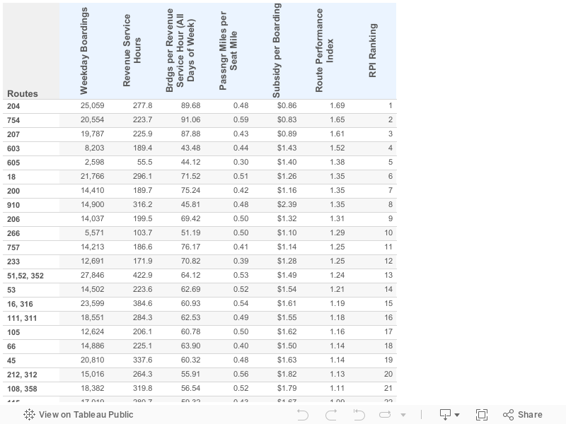
Los Angeles Metro has developed a new metric to help it objectively evaluate how its bus lines are doing on a few key measures: subsidy per passenger, riders per hour of service, and share of seats filled throughout the day. It's called the Route Performance Index, and the results are helping Metro design a new, expanded frequent transit network. The RPI allows them to identify laggards in the bus network, eliminate or alter those services, and repurpose the saved hours into better-performing lines, ultimately covering a larger share of the county in high-quality transit service that runs every 15 minutes or less. If you're interested in learning more about it, I suggest reading Jarrett Walker's post at his blog, Human Transit.
I wasn't able to find the results of the evaluation, except for this presentation that identifies the worst-performing lines in the network, so I asked Metro to send it to me. (Thanks Public Records Act!)
I got it yesterday and don't have time to do any real analysis of the numbers, but I wanted to share it as a public resource for anyone interested in diving into the details. In addition to subsidy per boarding, passengers per revenue service hour, and passenger miles per seat mile for each line, it also has information on total daily weekday boardings, daily revenue service hours (not sure if these are scheduled or actual), the RPI value (the highest is 1.69, the lowest is 0.27), and the ranking according to RPI score. You can find all the data in the Tableau table below, or you can download the original Excel file from this Dropbox link. Have fun!